This Is The Logo For The 2025 Nordic World Ski Championships
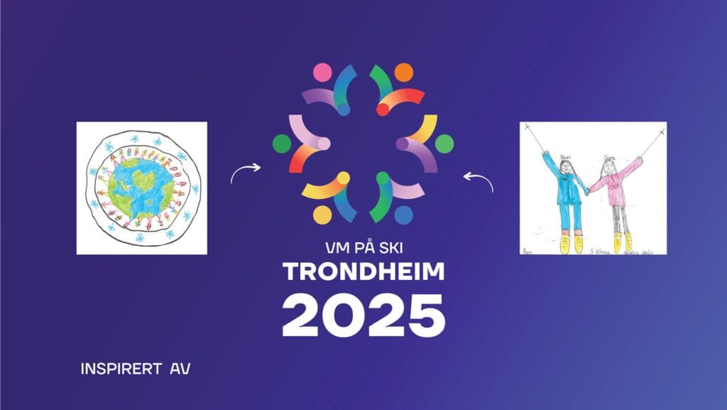
The logo for the 2025 Nordic World Ski Championships in Trondheim, Norway, was launched and focused on sustainability, inclusion, and diversity.
Last Thursday, October 6, the 2025 World Championships logo was launched during a press conference in Trondheim.
“The new World Championships logo shows the world a clear picture of a future-oriented championship. The 2025 World Championships is founded on community, public celebration, inclusion, and sustainability, with a clear goal of using the championship to create lasting values for skiing and society. The new logo makes it easy to communicate that,” says Haakon Jensen, head of marketing and brand at the World Ski Championships.
Thousands of children’s drawings submitted
Children and young people from all over Trøndelag and Norway have helped to shape the logo through a ski World Championships’ drawing competition.
A common feature of the contributions was the globe and people holding hands, which testifies to a committed generation that cares about the climate and unity. The World Championships organizers believe this aligns with the World Championships company’s values, namely skiing fun, folk festival, cooperation, sustainability, and diversity.
“It’s fun to see thousands of children and young people’s commitment to the World Ski Championships. The children have given the World Championships a unique character,” says Jensen.

A modern version of Snørosa
Trondheim Mayor Rita Ottervik is delighted:
“This is the symbol of an event that will be a folk festival for everyone, and which is environmentally friendly and incorporates important values such as diversity. Thus, the World Championships symbol gives meaning beyond the fact that it is nice,” says Ottervik.
The president of the Norwegian Ski Association is also optimistic about the logo:
“You rarely find a logo so exuberant – right away,” says the president of the Norwegian Ski Association, Tove Moe Dyrhaug, elaborating on the first impression:
“I see commitment, joy, and Snørosa (from World Championships 97), but this is a more updated version that fits well with the times,” Tove Moe Dyrhaug says in a press release.
Subscribe to our newsletter
Most read
-
21.02.2026
-
03.12.2021
-
22.02.2026
-
30.08.2026
-
18.02.2026


More Articles
-
Season XVIII continues with Engadin La Diagonela in Switzerland
Ski Classics World Championship Season XVIII heads to Switzerland on Saturday, January 16, 2027, with the Engadin La Diagonela, a 55km classic race from Pontresina to Zuoz.20.09.2026